
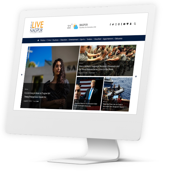
We are unveiling a detailed look into the creative process behind the UX UI design and digital development of The Live Nagpur, an online and indigenous news portal. This portal facilitated uncluttered, swift, and precise news consumption for the public, enabled by its standout UX and UI designs.
DELIVERABLES
UX Design
UI Design
Development
LAUNCH DATE
November 2019
The inspiration behind starting The Live Nagpur lied in the absence of digital news providers who primarily focused on the Nagpur District. This news portal not only aimed at keeping people abreast of the daily region specific news and key information, but also indented to keep its readers up to date with national and international headlines through unbiased reporting, that was core to their ethos.
The immediate challenges that our design and product development team faced was the client’s lack of familiarity with digital product development and design processes, which were key for the developmentv of a digital news portal.


To add to that, there existed stiff competition in the industry from better capitalized and much more recognized national news portals.
To add to that, there existed stiff competition in the industry from better capitalized and much more recognized national news portals.


A key goal that our team identified was to ensure that we delivered a scalable project, which could sustain increased traffic while allowing multiple editors to update and upload content simultaneously.

We wanted to be able to develop an ingenious yet simple interface that loaded swiftly and enabled the portal to better hold the user’s attention.

A unique feature of this project was that we were catering two distinct set of end users with their unique requirements. The first set being the readers for whom we needed to craft an intuitive and uncluttered navigation experience. And the other set being the client for whom we needed to create a manageable product that they could operate efficiently. We also aimed to facilitate simultaneous and multiple log-ins at the client’s end.
We had figured out two user group for the website. One was the locals who would use the expressway, and the other was investors. Attracting Foreign and local investors, along with High Networth Individuals (HNIs), was a major reason, why we were appointed to redesign the website. And consequently, our designers began exhaustive R&D Sessions on the aesthetic inclinations of this target audience. We identified that the visual inclinations of the west were minimalistic, and this became a design linchpin for us.

Our designing and product engineering team was tasked with developing the entire digital model for The Live Nagpur project. The client’s limited understanding in this field made it crucial that we ideated, designed and implemented the entire digital spectrum of this project. We also took up on the task to gradually limit the client’s dependence on us to run this operation.
Our designing and product engineering team was tasked with developing the entire digital model for The Live Nagpur project. The client’s limited understanding in this field made it crucial that we ideated, designed and implemented the entire digital spectrum of this project. We also took up on the task to gradually limit the client’s dependence on us to run this operation.
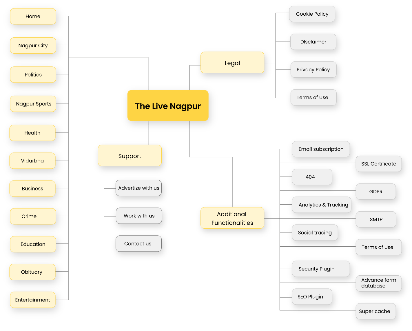
During the UX designing of the project we were focused on planning a smooth navigation for the readers. We created a mind-map, planning their distinct journeys.
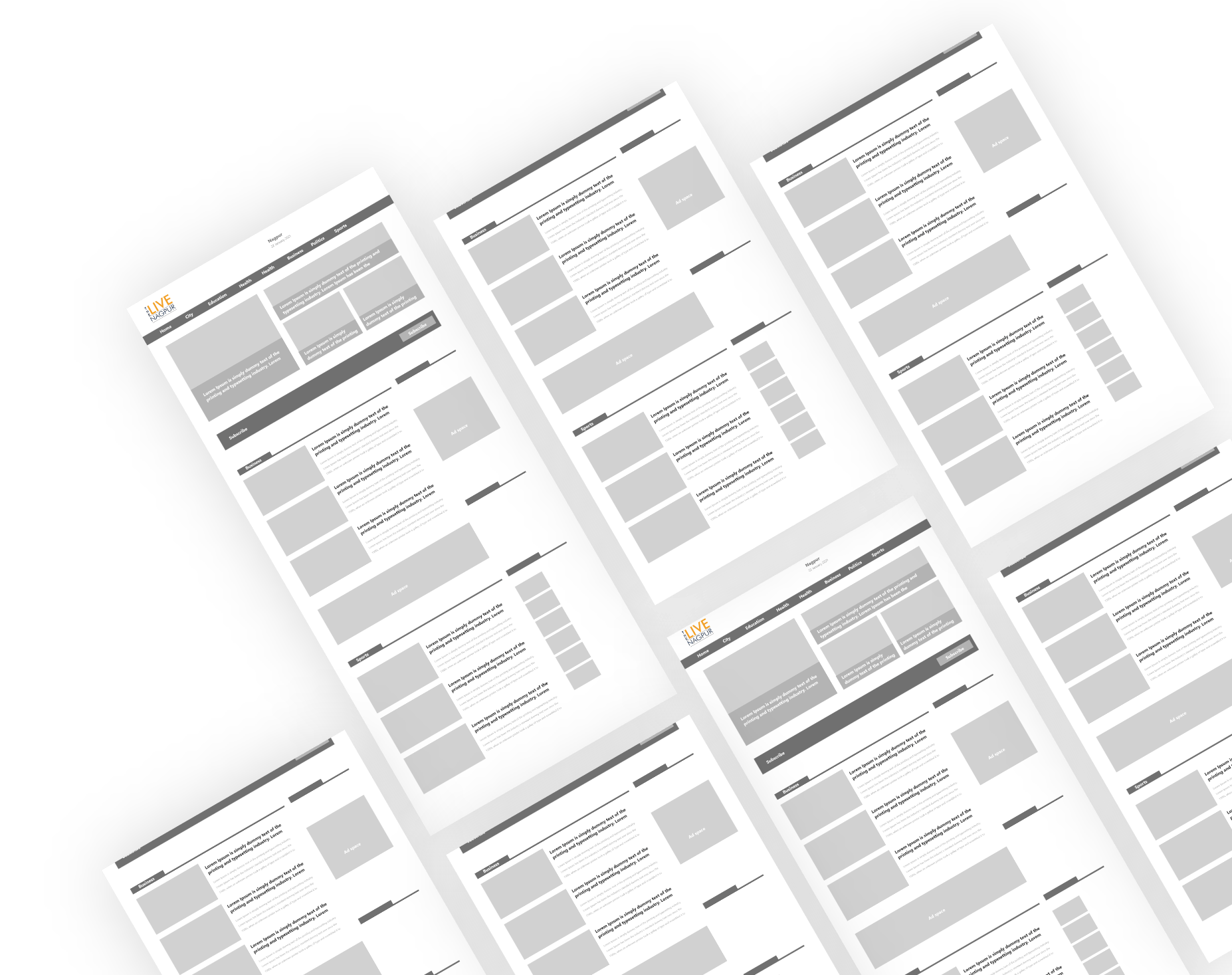
We then moved on to develop wireframes to decide on a basic structure of the website. To make the portal simple and easy to navigate we created news pillars that aided the segmentation of different news types. The intention here was to streamline a reader’s experience and lead them swiftly to the stories of their liking to improve bounce rate.
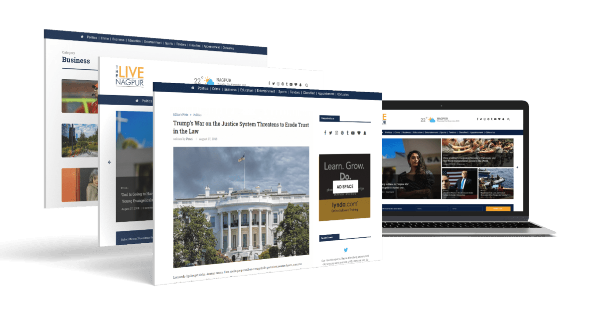
Our next task was to work on the visual aspects of the design. We identified the color schemes and font styles that resonated best with people. We also settled on the optimal length for the news story, to augment interaction time. We also decided on the type of thumbnails and their placements.


The first challenge for us was to decide on a publishing platform. We identified early on to not overwhelm the client with backend development with JAVA Scripting or html. And so we squared on WordPress as the publishing platform. WordPress was a consensus choice for our team owing to the following reasons:


After the website was made live there was a gradual increase in the traffic and the portal garnered a tangible reader base which kept on broadening with time. The number of reporters also increased and so did the news stories. To effectively manage this growth we shifted the website to a better and heftier server. For this we chose the Virtual Private Server (VPS). VPS hosting was cost effective, secured and dependable.

Additionaly the client presented us with the challenge to extensively track the advertisements displayed on the portal. Their advertisers further wanted to measure precise performance of their ads. To tackle both these asks we installed an elaborate ad system into the portal rather than just incorporating a provision to show ads. Owing to this rigorous ad system we could help generate the exact engagement and impressions garnered by every individual ad being showcased in the portal. To again work towards eliminating their dependency on us we created ad slots for them where they could add new ads.

Now our next focus area was to understand user behavior and their interaction with the website. To do this efficiently we employed third party tools such as Hotjar and Google Analytics. Through these tools we conducted a detailed study of the user behavior and based on that we fine tuned the website’s interface. One major area that was revamped after these User Acceptance Tests was the section of ‘Related News’. This step significantly improved the time that readers spent on the portal.
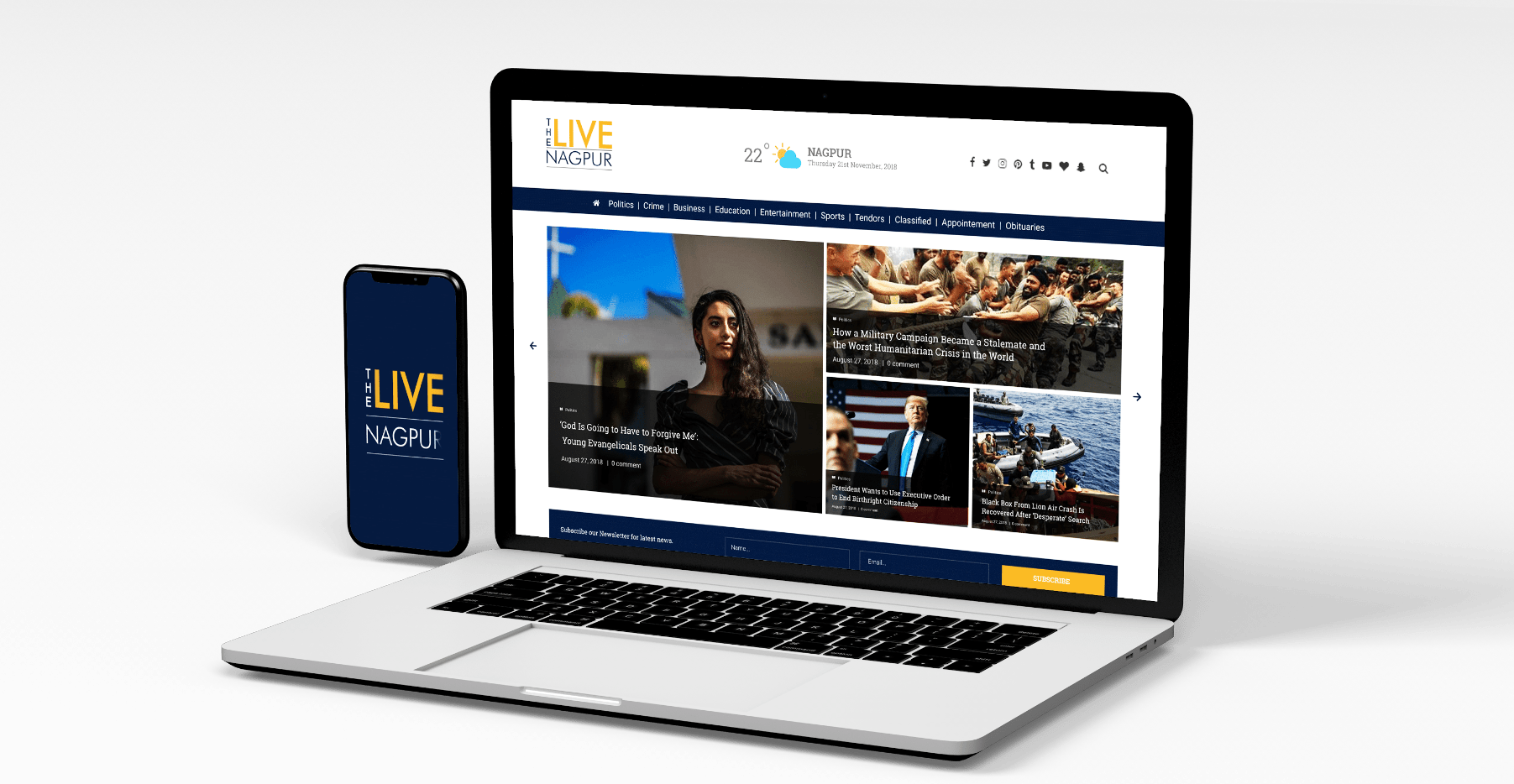
The final interface was simple and accessible to readers of varying levels of tech literacy. The layout was absorbing, and the light background accentuated the graphics and visuals that accompanied different news stories. The clear and legible typography made the information effortlessly readable.

Now that we had successfully established the digital news portal, the next step for us was to develop a swift Mobile Application. We took forward the same design ethics of swift user experience and aesthetically pleasing user interface, to guide us into developing the App. And the end product was once again intuitive, uncluttered, and speedy. And these design nuances led to a rapidly increasing app installations.
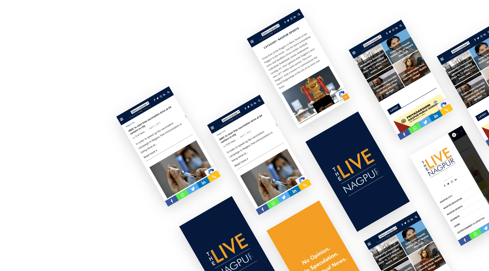
The Live Nagpur website continued to see exponential growth and had a staggering reader base. In fact in the very early stages of phase three it went on to become the most popular online news portal in Nagpur. And as a result we tackled this growth and sustained readers’ propensity by incessantly running a glitch free website, managing this deluge of traffic, while simultaneously securing all the data.
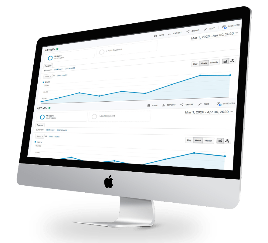

app installations

Readers per month
In conclusion, when we look back at our journey with The Live Nagpur Project, we have a lot of numeric data that talks about the number of readers the portal witnesses, and the number of application installations, but we still feel our biggest achievement lies in having made the client adept and comfortable with operating the website independently. All through this journey we were focused on decreasing their dependence on us and we are happy for having made this possible. The client despite us transcending into new ventures could keep up with the growth. We have not only introduced them to the digital landscape but also given them the confidence to explore it adventurously and be open to more complex ventures.


I can’t thank team Zukux enough for The Live Nagpur. This was my passion project but I had no working knowledge of fleshing out this idea on a digital platform. The team was sensitive to my lacking in the area and they not only designed and published the website but guided me as it became one of the most popular websites in the Nagpur region. They also anticipated the subsequent development of a mobile application early on and gave us a kick start in the field. My association with them has been a wonderful learning experience for me and my team.
The Live Nagpur
WEBSITE REDESIGN
